Into the Woods

indian-head-summer-big-edition-kraus


Driving down a winding country road, trees looming large on both sides of the road, windows rolled all the way down, and the smell of balsam strong in the air, I thought 0 for the first time in my life, I think – wouldn’t it be incredible to have a little cabin in the woods? Ok, ideally the woods would be more like a lakefront clearing, and the cabin would be a lodge with more than just the most basic of amenities. But you get the point. Villa Rustica.

Last week some family members and I took a day trip into the Adirondack region of Upstate New York. Long a getaway for nature lovers, sportsmen, and wealthy city-dwellers, the region has a long history as an R&R refuge for generations of families. Lake Placid, one of the villages we visited, has even played host to the Winter Olympics – twice! Everyone from the Vanderbilts to Michelle Williams has called the area home. In fact, Michelle Williams recently got married in secret at her home there, where she had lived for years following Heath Ledger’s death. But really, the celebrity pedigree doesn’t matter, when the towns are this charming and the scenery is this beautiful. And as far as scenic getaways go, it’s quite affordable.

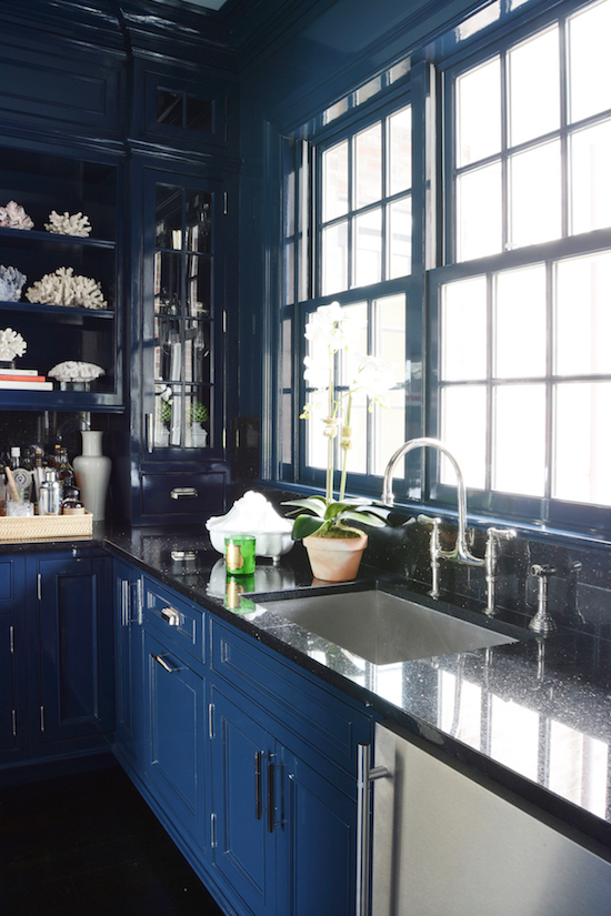
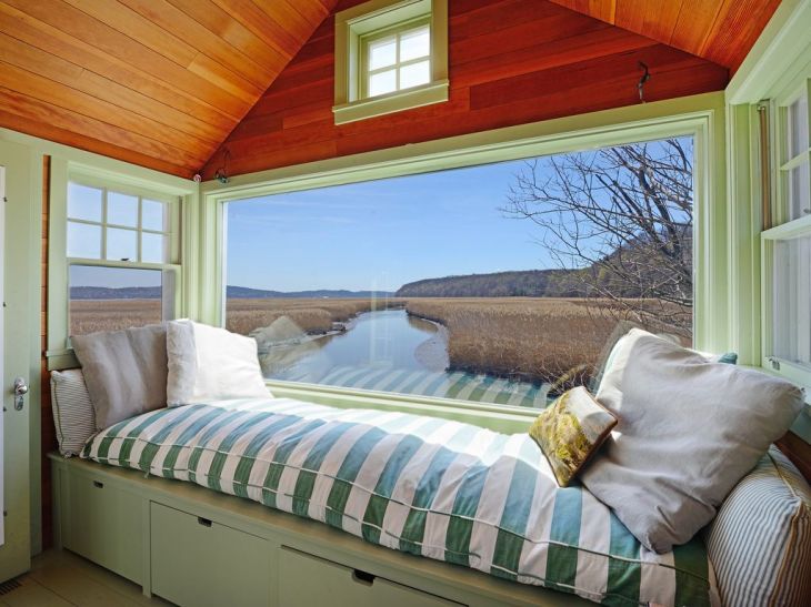
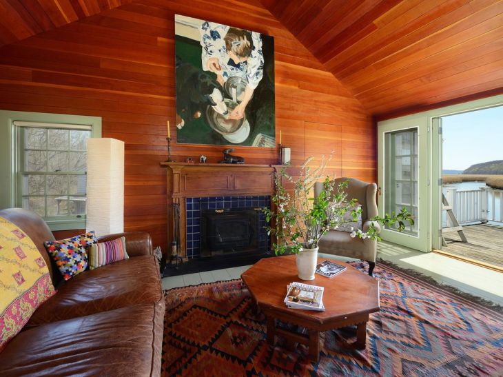
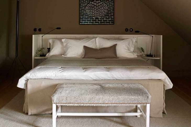
Long story short; it got me thinking. If I had a small lakeside cabin/lodge, how would I outfit it? It seems the trap would be to either be too polished, losing sense of place, or to err on the side of being too unfussy, too rustic, sacrificing a more personal design in favor of utility and local tradition. How do you strike the balance? I’ve included two photos below as examples of a starting point. You purchase a cabin, it likely comes at least partially furnished. Where do you go from there?

Inspiring-Images-of-DSC_0216.jpg-Small-Bedroom-Ideas-With-Double-Bed-Creative-Decorating-Ideas-768x510lakefrontgreat

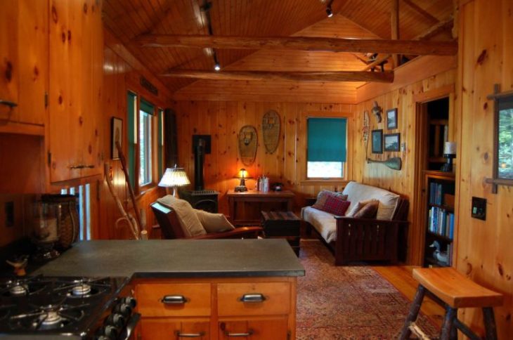
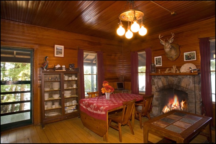
Now don’t get me wrong, I like the simplicity, the comfort, the homey feel. But if I were the owner, and had say, $15,000 to make some upgrades, what would I do? For starters, I would not touch the hardwood floors, the wooden paneled walls and ceilings, the stone fireplace or the little black wood-stove. Those things feel so thoroughly part of the vernacular that to eliminate them or hide them would be inappropriate design. But rugs, seating, tables, light fixtures, and wall adornments are all fair game. Taxidermy? No thanks. Oars on the wall? I feel the same way about oars as decor as I do surfboards as decor. It’s gotta go. Below are some ideas:

ckq

vintage Calvin Klein quiltCapturelight

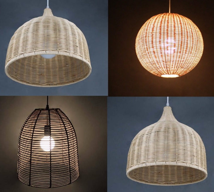
farmhouse lighting – simple and elegant 11502483_master

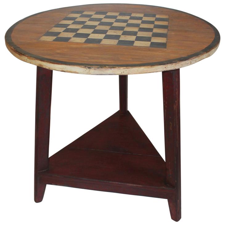
vintage game table, perfect for a rainy day but pretty to look at all the time and so fitting for a vacation cabinORG_2865022

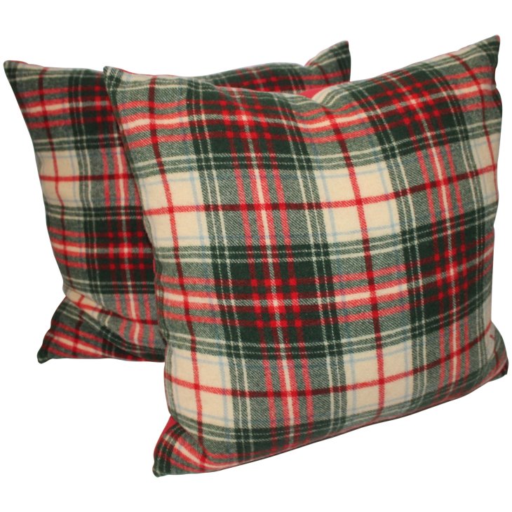
warm, classic throw pillows in a nice plaidtim.clarke.interior.design.leather.weaved.dining.chair.furniture.furniture.seating.leather.wood.1487134693

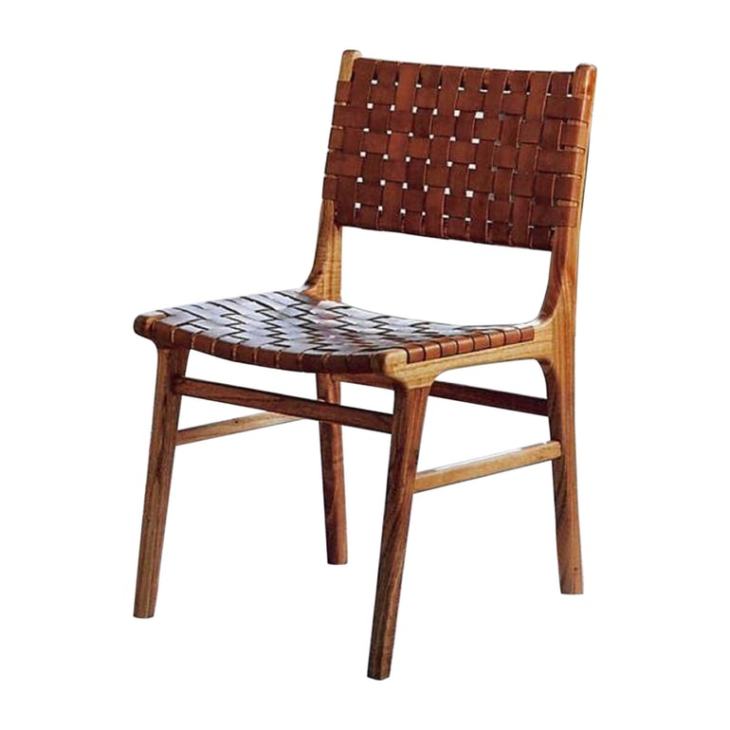
leather weave dining chairs30224_Oushak_8_01_x_10_00_6_master

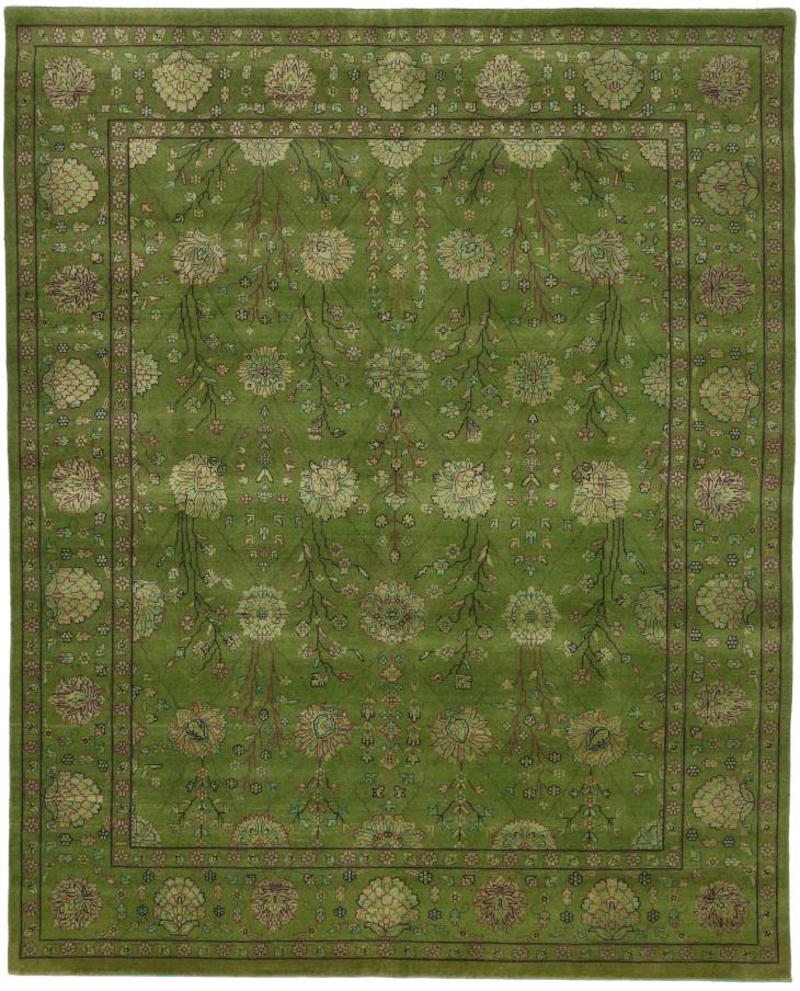
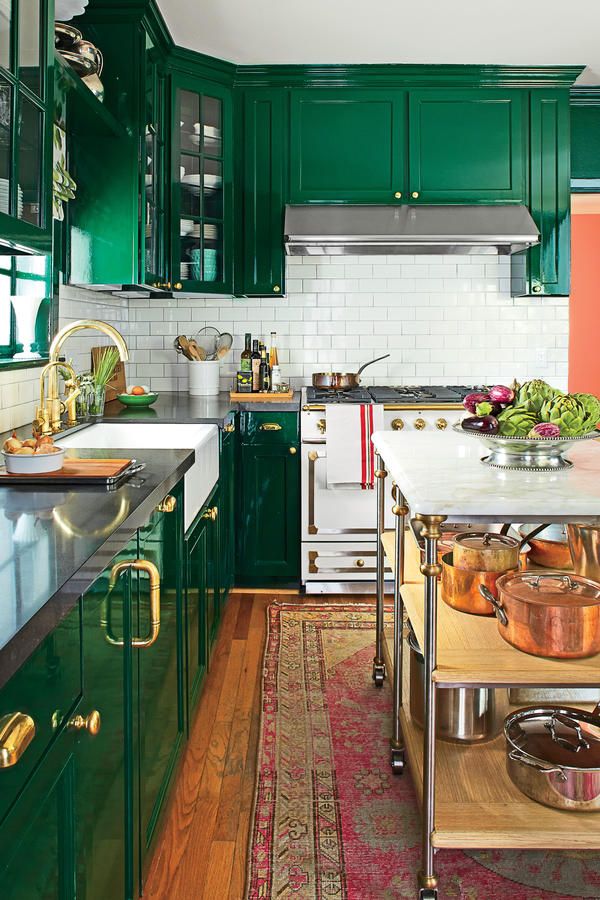
I love this green rug, you wouldn’t want too loud of a pattern since there’s lots of other pattern around, and the green brings the outdoors in

capcap

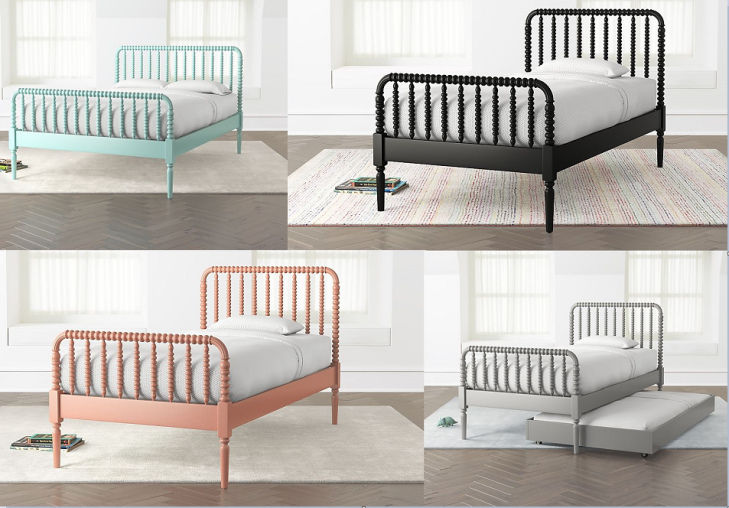
multicolor wooden beds. I like the detailing

b2a0ee1e310208b290ab398add53a2ea

again with the green – love this “rosemary” color from Le Creuset alluring-wicker-coffee-table-coffee-tables-rooms-gardens

rattan/wicker coffee table

anthrop

could look stuffy in a different fabric, but this print is fun and classy and would work well to offset more rustic pieces

anthr

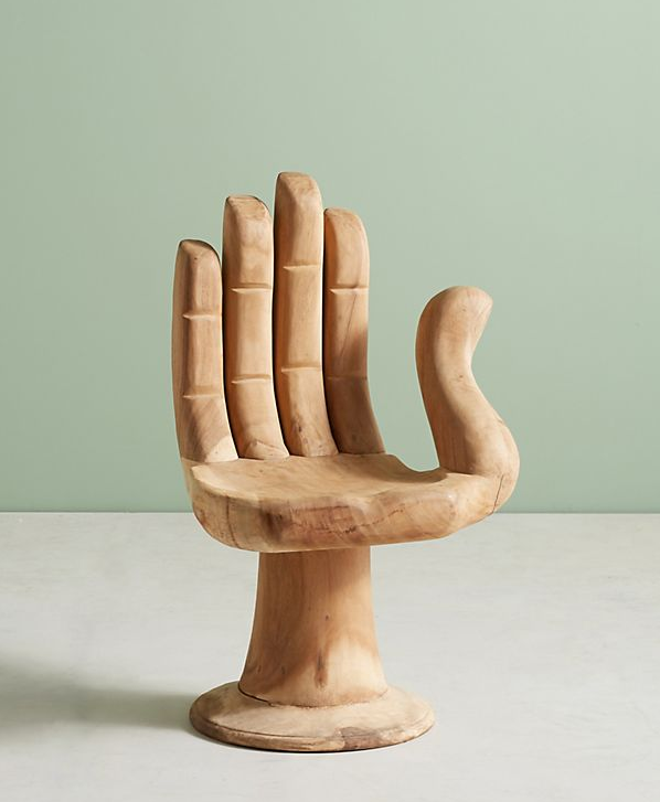
Got to have some whimsy, something fun. This chair provides that

anth

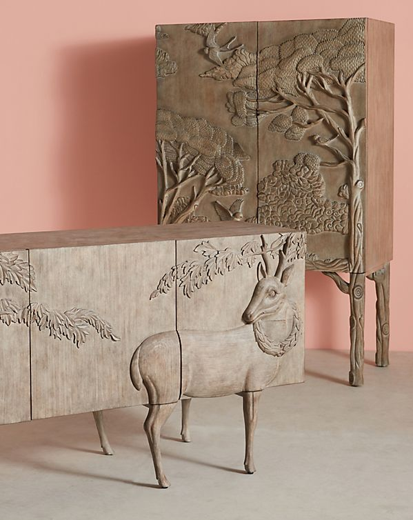
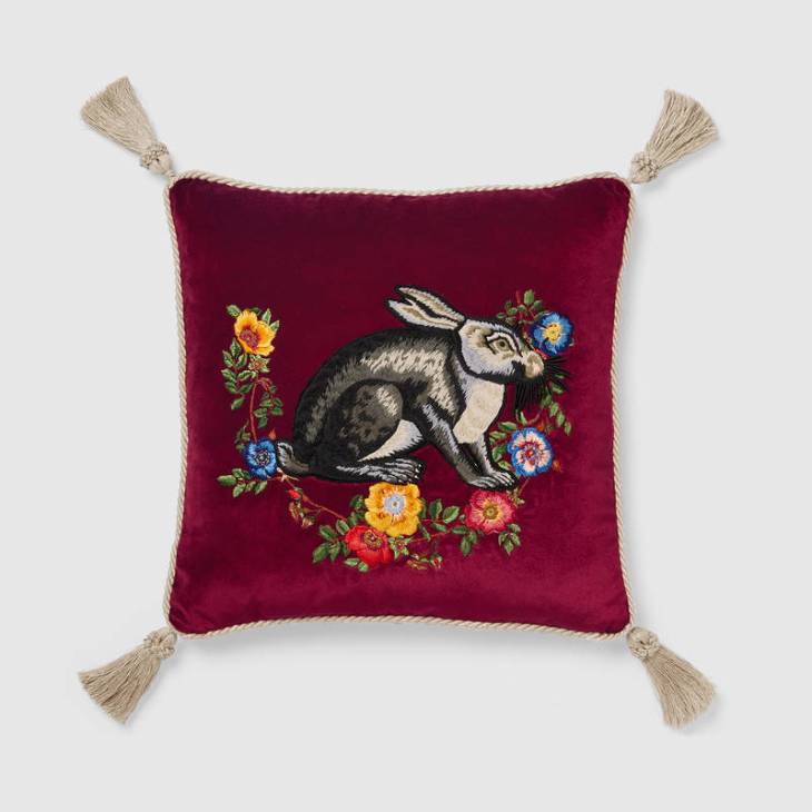
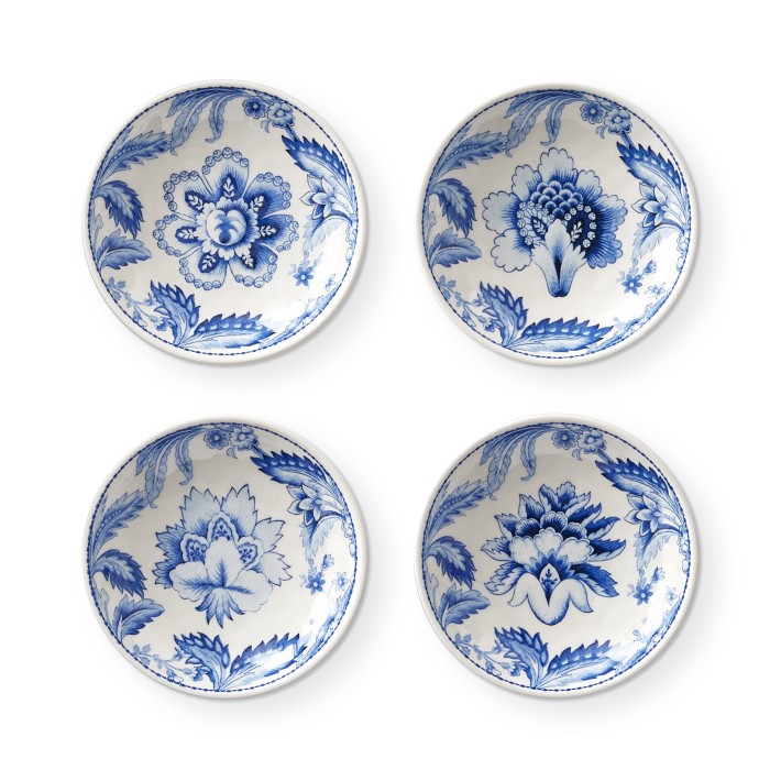
and in case the chair wasn’t enough whimsy, these certainly are

DGD_Sofa_Plaid1_Edit_WEB_master
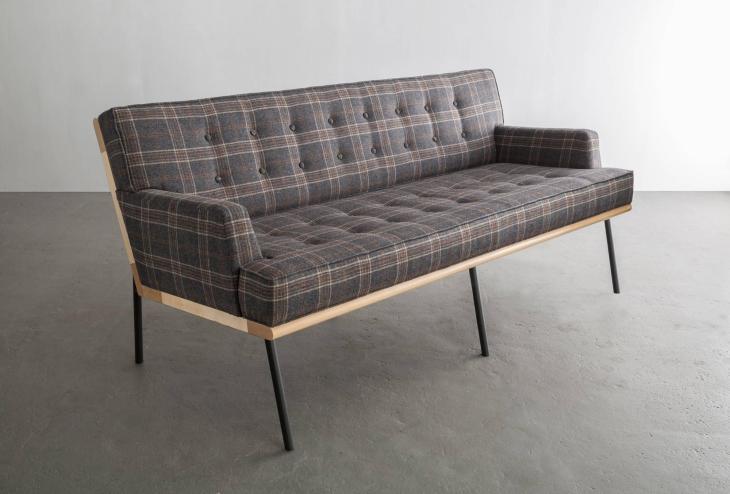
Love that this feels modern, and rustic. Beautiful subdued plaid and visible wood. A great piece.

anthro

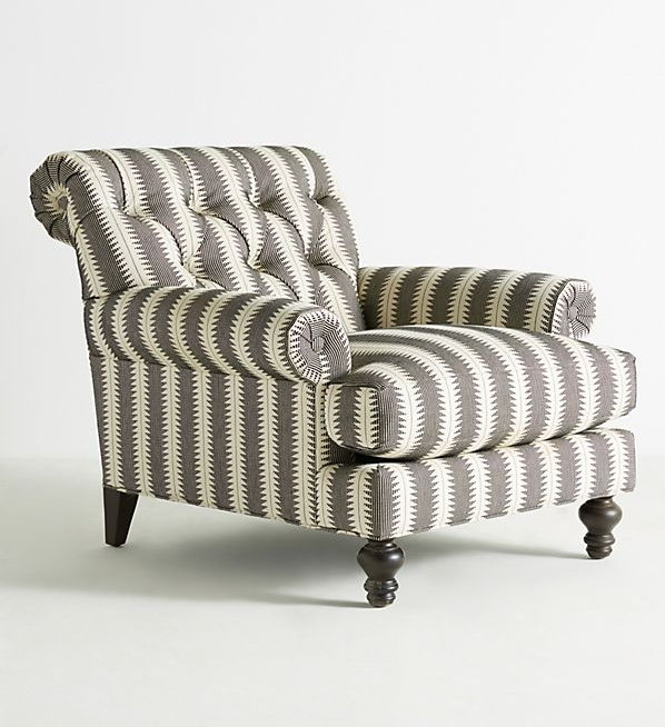
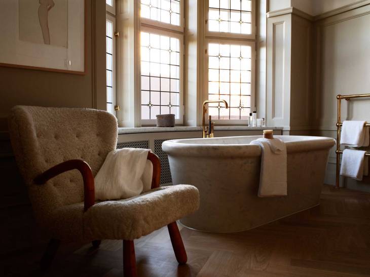
Absolutely love this chair. Texture, pattern, detail. Pure class!

Blue is the Warmest Color

aerin2

It’s 94 degrees outside today in Syracuse. With humidity factored in, the heat index is flirting with intolerable, somewhere slightly north of 100. I’ve got not one, but two fans running in my bedroom, and the curtains drawn to help beat the heat. Whether I like it or not, the sun is on my mind. Tomorrow is July 1st and the 4th is coming up quickly, so I may as well lean into the summer heat and look for a silver lining. If you’re a type who hosts, there’s no end of options for outdoor entertaining, a fête in the afternoon sun.

I’ve recently been enviously eyeing Aerin Lauder’s collection for Williams Sonoma, and I think it’s the seasonal ideal. Not terribly expensive. Bowls as low as $20 on sale for a set of 4 and a serving platter only a few dollars above that, on sale. I’m thinking a 4th of July outdoor get-together. Red meat on the grill, blue and white dishware, and plenty of cold drinks. I’d skip the table clothes, the vases with expensive flowers, the poshness of it all. Simplicity works, let your guests enjoy the backyard, the grass, the foliage, the unpicked flowers. Picnic tables or even sitting on the grass, buffet style. I’m imagining just stacks of these beautiful dishes and good food and you’ve got yourself an unpretentious gathering  but with an element of refinement. However, the styling in a few of the photos puts them in a more styled context, and of course they’re equally beautiful, if not quite “me”. Nothing terribly original about this idea, it’s been done to death, but these items are all beautiful enough that you wouldn’t want to put them away even when the weather turns cold. These dishes could hold a place of pride in any stylish home, if you ask me.

aerin6aerin5aerin4aerin3aerin1aerinaerin-sea-blue-geometric-platter-o

There’s also a smaller selection of blue, white, and green dishes that I love also. For those who find blue and white china a bit passé, maybe this would be the ideal twist. It retains the classic look of blue and white china but the green twist feels more quirky, personal, whimsical.

aerin-ardsley-dinner-plates-oaerin-ardsley-serving-bowl-o

Taking Up Residence

etthem

About a year ago, in the midst of one of my endless “what should I watch?” netflix scrolling sessions, I stumbled upon a documentary series titled ABSTRACT: The Art of Design. Each of the 8 episodes focused on a designer at the top of their particular field, be it architecture, illustration, automotive design, or photography. The episode I was immediately drawn to watch first, however, was the very last one, focused on the celebrated interior designer Ilse Crawford. I’d heard her name, knew she was the founder of Elle Decor magazine, but not much else. After the hour-long episode, she had my full respect and admiration. I loved how she thought outside the box, how she never sacrificed comfort for style, that she didn’t follow trends, she created them.

One example of Ilse’s work highlighted in ABSTRACT was a hotel she’d been commissioned to design. Built in 1910 as a private arts and crafts style Mansion in Stockholm, it was to be converted into an upscale hotel called “Ett Hem”, which is Swedish for “A Home”. Ilse’s revolutionary idea, before the craze of Airbnb had really taken off, was to rethink what a traveler who takes the time to seek out a boutique hotel might want. She reasoned that there was something glamorous and aspirational about the idea of being handed the keys to someone’s home, having free reign of the place. And so she set about creating a hotel that didn’t feel like one, with 12  private bedrooms/suites, but  with fully a stocked, residential-designed kitchen, library, dining room, sunroom, living room, etc. It’s meant to be a home away from home, or as I like to imagine it’s as if you have a wealthy friend with a country house and you’ve been invited for the weekend. You’re encouraged to live in it, treat it as your own. Perhaps the idea, years later, doesn’t feel so revolutionary, but I believe at the time it was. Especially for a 5-star luxury hotel. You’ve got talented chefs and a full staff at your beck and call. I’ve seen the idea imitated several times since. A stay here is definitely on the ol’ bucket list.

Etthem_20120828_089etthem1Ett-Hem-0188-1Etthem120425_056_3Etthem120426_036_fix1Etthem120426_126Etthem120426_187Ett-Hem-20120511-44316_med_eldEtt-Hem-20120511-44417ettscreen-shot-2013-03-25-at-10-52-28-ambanner-1-1-1455x970large

Something Wicker This Way Comes

wicker-chair_2-648x648

Winter ended, I hope, this past Sunday with a last snow flurry, and just a few days later, it was nearly 90 degrees. To my dismay, it would seem  we skipped Spring and headed straight from Winter to Summer. But, as they say, when life gives you lemons, make lemonade. Since I’m no Beyoncé, my lemonade won’t be in the form of a hit Grammy-winning album and since I’m trying to kick my sugar habit, it wont be the Minute Maid variety, either. Instead I’ll sweep my own particular brand of summer-induced seasonal effective disorder under the rug and lean into Summer by way of blogging about it from indoors, with the fan turned as high as it will go.

Thinking about Summer design, wicker came instantly to mind. Most people may associate wicker with outdoor furniture and as such with summer (at least for people living in locations with distinct seasons), and I do too, but I also remember a large wicker basket in our house when I was growing up, that at times served as a kind of family roof coffee table/toy bin/blanket storage. Indoor, outdoor. Seasonal, year-round. Wicker’s like that, it’s versatile. It’s warm, it’s natural, it feels casual as is often the case, there can be glamour to a piece that feels handmade with skill.

I have long kept an eye out for wicker furniture to store in the massive imaginary furniture warehouse inside my head, for future use. The key, I think, is often unusual shapes or unusual uses. A wicker lighting pendant would catch anyone’s attention. A midcentury modern piece with clean lines that incorporate wicker would be a sharp look as well. And of course the classics never go out of style. Below are a few samples of wicker items I’ve scoured the internet for, ranging from $150 (the handmade pendant lighting I found on Etsy) to $3,000 (the 1960’s vintage German pair of chairs, found on 1stdibs). Warm weather may have inspired wicker as my blog post topic today, but I’m standing firm in my conviction that I prefer being indoors. As you can see, I chose pieces for the indoors. However, since wicker is versatile, a few could be used outdoors – and certainly on an enclosed porch or sun-room – as well if need be.  These selections, I feel, would add that extra something to a room or backyard patio.

collezioni_contemporanei_missbclassic_wheels_titoagnolie18ed65c1a3234de3b7c0247eead8bc6--wicker-table-rattan-furnituremarvelous-wicker-coffee-table-coffee-tables-ideas-awesome-wicker-coffee-table-with-storagewickercollezioni_decor_francine_armchair_franzsartoriwicker-chair_3-648x648wicker5

Target Practice

Target_Opalhouse_Decor

Lately I’ve been thinking about my own place. Not that it’s happening in the immediate future (I currently live with family), but inevitably I will need to get my own place – likely a small one-bedroom or even studio apartment. I’ll finally have carte blanche when it comes to every single decision regarding design and function. The scenarios I’ve played out while pouring over Sotheby’s real estate listings will suddenly be a reality, albeit with one significant caveat. How do I reconcile years of inspiration via Architectural Digest with a Dollar Store budget?

I’ve never been a Target idolator, but I’ve always respected their collaborations with well-regarded and high-priced brands and designers. I like the idea that your average person can get a piece of the pie, can own a version of something they’d normally only be able to afford in a parallel, affluent life. Others criticized these collaborations, saying that the mass-market affordability (and the step-down in tangible quality necessary to make them happen)  cheapens the brand. The reason people want the brand in the first place is because of the quality and the exclusivity, so by doing a line at Target, is anyone really getting what they want? I can see both sides of the argument, but I think critics will be happier with Target’s newer approach. They’ve skipped the middle-man and created their own lines, inspired by trendier and more expensive brands. A brand’s reputation isn’t hurt, but Target shoppers can choose from items that are more in line with what they might be coveting online or in magazines than one would expect from such a massive, accessible store.

One such line created by Target seems to have caught the attention of many design bloggers and Instagram basics. It’s called OpalHouse and it’s incredibly (sometimes painfully) trendy, seemingly very heavily inspired by Anthropologie’s home collection of product. As I filtered through the 567 (!!) items available in the Opalhouse collection on target’s website, I thought about what items I’d consider purchasing, were I in need to furnishing my own place. Definitely best to avoid anything too trendy or attention grabbing, something that I wouldn’t get sick of, wouldn’t be embarrassed if any guest saw it, and things that reminded me of things I’d seen and wanted over the years, albeit at a much much MUCH lower price point. I decided to give myself a budget of $25 or less per item, and not to go crazy. I think it’s important your home didn’t look like someone else designed it, and picking too many items from one brand or one collection is a trap to adopting someone else’s taste as your own. Where’s the fun in that? Here’s what I came up with:

target1^ Plastic Tumblers 16oz ($1.99 each) and 22oz ($2.49 each)
targggg^ Velvet Fringe Pillow ($24.99)target5
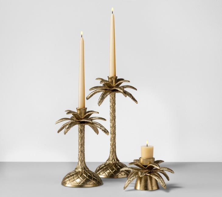
^ Palm Taper Candlesticks ($14.99 each)target10^ Artificial Palm Leaf Plant in Gold Base ($24.99) – I’m not sure I can keep a real one alivetarget13^ Various Wood and Cast Frames ($14.99 each)target7
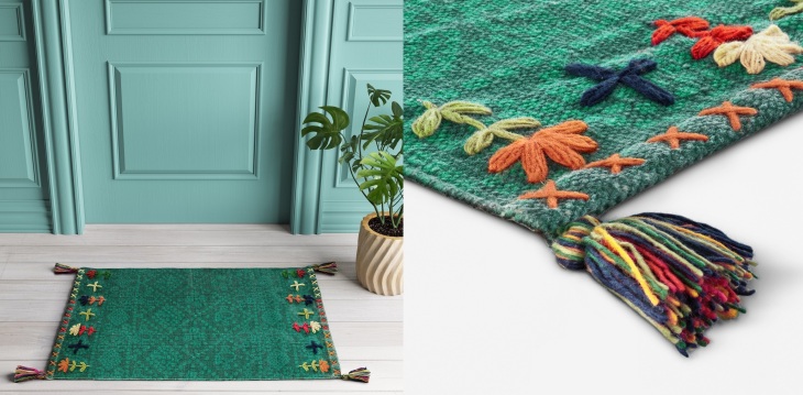
^ Green Embroidered Tassel Accent Rug ($19.99)target6
^ Floral Earthenware Vase ($14.99)

Can’t Hold My Lacquer

Lincoln-Park-Mansion-Library-wide-001-979x661

Blue Lacquer. It sounds, maybe, like a design trend from some 80’s more is more is more interior design fever dream. The reality? It’s a sophisticated, bold masterstroke. Instant low-key grandeur. Fresh but not trendy, daring and classic at once. It especially seams to work well with built-ins.  I think I’d use it in a home library or office, somewhere with books, a quiet room to get lost in. It gives a room instant history and mystery, and in some hues can work as a neutral, while still giving imparting visual interest. Some of these examples may not technically be lacquer  – instead they’re just high-gloss paint – but it’s the lacquered effect they were going for and which they achieved.


102065087_w2550801_Allis_0852Ceiling-design-for-hall-2014-hall-traditional-with-ceiling-light-blue-room-butlers-pantrydam-images-decor-2015-08-glossy-walls-glossy-walls-02toronto-high-gloss-lacquer-with-traditional-indoor-pots-and-planters-family-room-sectional-built-insa47281bb759b56c711343d030a3d7303250-West-10th-Street-steven-gambrel-habituallychic-006

a brief case for wood paneling

wood


It’s a House Hunters cliche. A young couple and a flustered realtor wander around a house more than a few decades old and they stumble upon a wood paneled room. If the realtor is lucky, the would-be-homebuyers suggest they can take down or paint the paneling to make it livable. More than likely, though, this young couple is mentally writing the house off. Too dated, too dark, not HGTV enough. I admit I’ve never been particularly fond of wood paneling, but recent examples of homeowners and designers embracing and updating the look instead of replacing it altogether have given me pause. Perhaps a wooden walls and ceilings can be cozy and even a kind of neutral that allows furniture, art, and fixtures to take center stage while still maintaining more visual interest than painted drywall.  As an example, I’ve chosen some photos from a real estate listing I’ve revisited many times over the past several months. While not traditional vertical wood paneling, I believe the principal applies here. Faced with wood ceilings, walls, floors, and trim, the homeowners chose to do the exact opposite of convention, painting wood trim and hardwood floors and leaving wooden walls and ceilings as-is. The results are spectacular, and it’s not just the views that do the trick. The balance of warm wood with pale pastel paint and light floors provide the perfect juxtaposition. An oversized paper lantern as the primary light fixture, simple furniture, and a few luxury details, such as marble counter tops help carry on the high-low, traditional-modern, light-dark, grounded-ethereal balance they have going on. Talk about real estate envy. From now on, when I see wood paneling or boards on ceilings or walls, I’ll think twice before mentally painting them over or ripping them out.


wood2wood3wood4wood5wood6wood7wood8wood9wood10

Going Green

green5

White cabinets. For years, it’s all you saw in magazines, HGTV, and popular home blogs. Studies were done that showed white cabinets were the most desired by home buyers. House flippers and mass-appeal designers were steadfast in their devotion to all white kitchens. Prior to that, it had been all dark woods. Super dark. Unnaturally dark. And before that, light wood, maybe a honeyed oak with lots of wood grain. Lately it’s all about painting cabinets in shades of grey. But isn’t it more fun to have an edge, to be an original?

In October 2013, Cameron Diaz’s Chelsea, Manhattan apartment  (pictured below, with the gold backsplash) was featured in a design magazine. Her kitchen was a revelation, bucking the trends, she chose dark, emerald green cabinets. I knew someday I’d like to design a home with a green kitchen, perhaps even for me. In the years since, I’ve found more examples of design forward homeowners taking a gamble on green and winning big every time. It’s distinctive, classy, bold, original, and grown-up. If all green cabinets feels like overload, consider painting just the base of the kitchen island. You could have an Emerald Isle of your very own.

greengreen2green3green4green6green7green8

Artsy Ugly Aesthetic


gucci1

Culture is like a rubber band. When pulled too far one way, it over-corrects, snapping back past the ideal and far into the opposing direction. For a while it seemed like minimalism was king. I’d flip through a magazine and find houses that could scarcely be called homes. All stark white walls, concrete floors, clean lines, bare bones. For the past several years, it’s been much the opposite, with trendsetters doing pattern on pattern on pattern. It has to be arabesque, embroidered, mixed textures, just layers of visual interest. I believe there’s a happy medium. Ornate and simple are both beautiful, and obviously design is a deeply personal expression, but it seems a mixture of both would be a natural fit for most. Somewhere along the line, I think the beauty got lost in the shuffle. Intricate designs, rich fabrics, and a sense of bespoke indulgence can be inspirational, but are designers leaning in too far? Those elements should serve the higher purpose of design, to inspire and contribute beauty to one’s surroundings. It seems the forest has been missed for the trees.

Maybe my point is best made by way of synecdoche. Consider Gucci’s fairly recent entry into the home decor marketplace. These cushions (starting at $1,150 apiece) are embroidered with detailed images, tasseled, fringed, and made of velvet. Are they also ugly? Is that the sign of the end of a design craze, when it’s been pushed beyond the limits of good taste? If someone spotted one of these in their grandmother’s apartment 20 years ago they’d smirk to themselves about how awful they were, and yet now the coolest among us are shelling out more than your average person takes home in a week to purchase pillow, just because Gucci told them to like them. I wonder what design would look like without branding. I guess it would just come down to good taste.


gucci2gucci3gucci4gucci6gucci8gucci9gucci11

Dreams of Nakashima

blog13

George Nakashima is everything you hope to achieve as a designer and artist. His work can be found in the homes of taste makers and king makers, A-list Hollywood stars and revered designers. As a creator, his style is distinctive, immediately recognizable. And yet, despite the overwhelming popularity of his creations, something about the timelessness of his craftsmanship and his ability to elevate and refine natural forms have kept his work from the good-taste repelling hell of mass-market trendiness.

I spend far more time than I care to admit perusing architecture and design magazines. As of today, I subscribe to four different Architecture and Interior Design magazines and often I ingest the latest issues of four or five others in the bookstore or grocery store magazine aisles. My internet search history consists of endless visits to Sothebys Real Estate, Houlihan Lawrence, Estately, Apartment Therapy, various editions of Curbed (house of the day tag being my favorite), the list goes on and on. Somehow without having any palpable connection to the world of architecture and design, it’s a significant part of my personal identity. In a home, an office, a public space, but especially when perusing real estate listings online, I’m often redesigning elements in my head. What would I change? What do I love? How does the design impact my mood? In a parallel universe I have a thriving design firm. But for now, I have access to a computer. Though I’m not creating, I can compile, mostly for myself.

How does George Nakashima fit into this? George Nakashima’s work fits everywhere, that’s what makes his work so tremendous. Though the work itself is understated – usually a single material (wood) often in a nature-made shape (spruced up through his workmanship) – it brings a room together. That’s an oft-used phrase; “it brings the room together”. To me it means it’s the necessary element that brings balance. Nakashima can work in a sparely decorated mid-century home, contrasting the clean lines and man-made-perfect look of an Eames piece with an organic shape. A Nakashima coffee table will bring instant masculinity to a feminine room, it will bring comfort to a modernist scheme. A Nakashima dining table will make a very formal dining room a more accessible room. In my parallel life as a high functioning master of interiors, a Nakashima work will always have a seat at the table. The proof is in the pudding. Below are just a few examples of his work at work. It’s unmistakable, immediately visible, but not ostentatious. Great design. One day I’d like to own a piece or seven.


blog2blog5blog7blog61117-AD-MOOR01-01_sqblog9blog3blog8